Creating clear and meaningful design together

Every project starts differently. Sometimes the question is already well defined, while other times it is still taking shape. What always stays the same is the way we work together: openly, collaboratively and step by step. The process adapts to the project, the content and the people behind it.

Listen and understand

Every project begins with listening. What is the challenge? What information is involved? And what message do you want your audience to take away?

Together we explore the content, the context and the message, creating a clear foundation to build on.

Explore and visualise

With that foundation in place, the exploration begins. Information is organised and translated into possible directions through sketches, structures, visualisations and concepts.

This is where information design becomes visible. Complex information is gradually transformed into visual communication, not to oversimplify it, but to make clear what truly matters.

Refine together

Refinement doesn't happen only at the end of the process. Throughout the project I regularly share progress so we can review, discuss and improve it together. This ensures that the design develops in the right direction.

Working this way keeps every decision grounded and results in a design that is not only visually strong, but also fully aligned with the original question.

From process to result

Throughout the entire project, you are involved every step of the way. The process is transparent and collaborative, with plenty of room for discussion and feedback. By combining care, precision and collaboration, the final result becomes something that not only answers the question, but also feels right for you.

Case: Logo Channin

Idea & concept

The Channin logo started with defining the concept. What should this mark communicate? It had to be personal and reflect something about who I am, while also expressing what I do. That combination of who I am and how I work became the foundation. Translating information into form in a way that feels meaningful and authentic.
From data to content

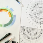
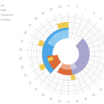
The first step was collecting different types of personal data, from characteristics and routines to significant moments in my life. Eventually, I chose to build the logo around a timeline, highlighting the experiences that shaped who I am and how I work today. This timeline became the conceptual foundation of the design.
From content to form

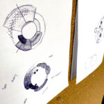
Next came sketching. Initially, I explored shapes and structures without using the actual data, testing different ways of translating the concept visually. Once the direction became clear, I started incorporating the data itself. Rather than visualising everything, I carefully selected the moments that were most meaningful. The goal was never completeness, but creating meaning.
Design & refinement

With the structure in place, the design process continued through colour, typography and composition. Every choice was considered in relation to how I wanted Channin to be perceived. Colours were selected not only for their appearance, but also for the feeling and meaning they convey. By comparing different versions and refining them step by step, the logo gradually evolved into a visual identity that combines content and form. It is not only a logo, but also a compact reflection of how I think and work.
Designing from content

This process reflects the way I approach every project: first understanding, then structuring, and only then designing. Whether I'm creating a data visualisation, a visual identity or another design solution, the process always starts with the content.

Curious?

Do you have a question, an idea or a challenge involving information and are you curious how Channin could help? Feel free to get in touch.

"Simplicity where possible and depth where necessary."

Back To Top